How I Furnished My Small Brooklyn Living Room
New York and overpriced shoebox apartments go together like summer and ice cream. Everyone who lives here knows paying high rents is par for the course. And as much as I complain about the money leaving my bank account each month, nowhere fits my lifestyle better than New York.
Do I also dream of a big house with a large backyard and high ceilings? Yes. But do I love my small apartment? Also yes. It doesn’t have to make sense. Like every successful startup founder will tell you, out of a problem, innovation is born — or maybe it’s just something you say when you suffer from New York trauma. The point is, I’ve learned how to be resourceful from furnishing a 975 sq. ft apartment with three bedrooms in Brooklyn.
The living room is the first place my roommate and I decorated together. We’ve had many iterations of it — one of them involving an ugly IKEA crate doubling as a credenza (picked out by an old roommate) — but we can finally say this version is our best work yet. So if you’re currently wondering how to make the most out of your small space (whether you just moved in or you’re on the market for new decor pieces), take inspiration from our living room makeover. These pieces checked all our boxes: aesthetic, affordable and playful.
Admittedly, the living room was the most important yet hardest space to furnish. You can paint your bedroom walls black and no one will care, but the living room details won’t get past any visitor. And if you’re like my sister Shels, she won’t hold back on what she really thinks. So you might as well make it something you’re proud of. Even if you don’t like to entertain and you’re a homebody like me 30 percent of the time, you still want it to be cozy and easy to navigate. With these thoughts in mind, we set out to optimize the living room with colors, textures and shapes that give it a sense of openness and warm hospitality. Here’s what we learned by trial and error.
1. START WITH THE COUCH
We based the rest of our decor on the couch since it will have a big presence in the room.
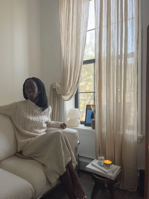
Our previous one came in a rich green color, but it contrasted with the gray floor and white walls, so we decided to go for something softer. The dimensions had to be right; the couch needed to be just small enough for the room, but spacious enough to comfortably seat a few people. We also didn’t want sharp edges, so we went for round angles and a curved armchair. We ultimately decided on this beige couch, which is a risky choice considering we love to have people over, but the color is just so calming. It doesn’t blend into the white walls, but matches them nicely. The lighter shade also makes the space feel more open, and the retro look.
Currently sold out, but here’s a similarly cozy couch
Urban Outfitters Isobel Love Seat
$1,199
Shop our exact coffee table
Urban Outfitters Huron Coffee Table
$299
2. PICK A THEME FOR YOUR COFFEE TABLE
Once we found our couch, our next project was the coffee table.
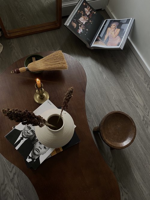
Since we also wanted a media console, we couldn’t fit a full size coffee table, so we looked for something slim and with round edges in communication with the couch. Realistically we couldn’t fit a full size coffee table in since there would be little space between the couch and media console so we needed something slim and simple. We found this uniquely shaped style on Urban Outfitters, and were intrigued by the pear shape. T The curved appearance allows for an easy walk between the couch and the media console without bumping your legs or worrying about the sharp edges.
3. GIVE THE ROOM DIMENSION WITH THE RIGHT MIRROR
For a sense of openness, I’d highly recommend going for a full body rectangular mirror.
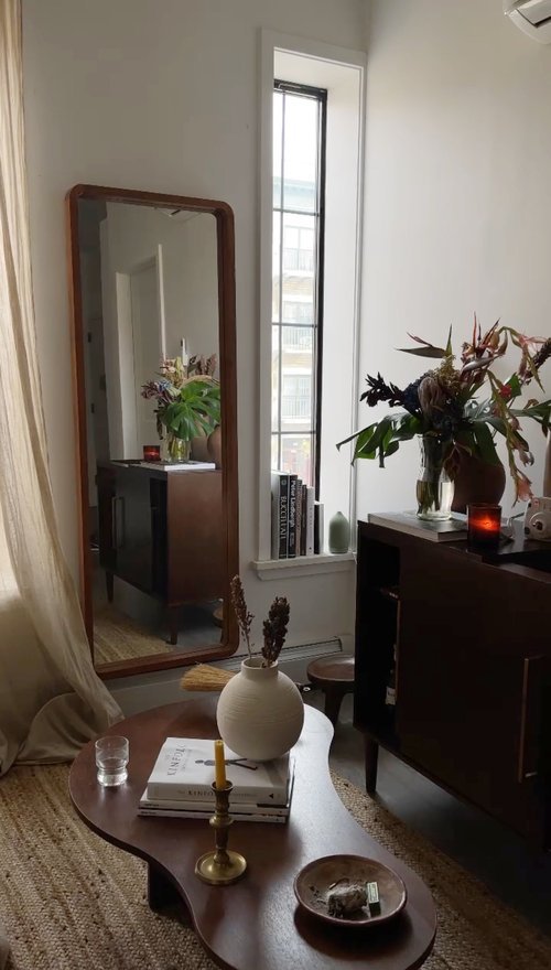
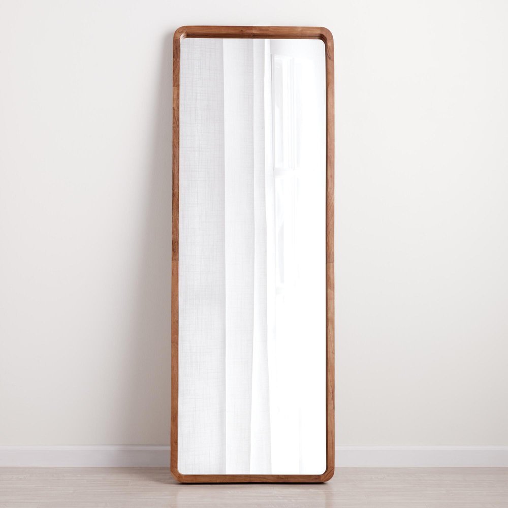
That way, you’re able to add some much needed length to the space, especially if your ceilings are low. Yes, round mirrors are sexy but they work better as accents in entryways and hallways for added coziness. . It’s so important to clear up the floor plan especially in a smaller environment. In our case, we ended up going for this thin wooden-framed mirror from World Market.
Shop our exact mirror
World Market Natural Wood Leaning Full Length Mirror
$250
4. GET CREATIVE WITH YOUR MEDIA CONSOLE
I’ll sound like a broken record, but because of our small space, our media console couldn’t just be a media console.
It needed to multitask as an entertainment center, bar station and library. So we went on the hunt for a multipurpose piece that does it all. We scrolled through Urban Outfitters (to also stay budget-conscious) and stumbled upon this gorgeous oak media console. We use it as a record station and bar cart, plus we store a lot of our cocktail and photography books in the compartments. With its clean minimal shape and deep wood color, it was the perfect addition to that corner. We enjoy styling it with not only the books, but also with our growing collection of records and some fresh blooms.
Shop our exact console
Urban Outfitters Crosley Media Console
$598
5. ADD DYNAMIC DECORATIVE ELEMENTS
Now that the bulk of the work was done, the fun part began: decorating.
I’m not going to lie like we didn’t buy some of these items before we had all the pieces together. Once you find something you love, you take it and figure it out later, right? At least, that’s my decorating philosophy (or maybe I have an unhealthy collecting habit). Luckily, all the pieces ended up working together nicely and it’s mostly because we had a theme. We cared about adding warmth with earthy pieces for a lived-in feel.
Our eyes were drawn to those small details that have a lot of presence, like our collection of books, the handcrafted stool from Of the Cloth, sheer lightweight curtains, and a pastel green record player. We then accessorized our coffee table and credenza with our photography, cooking books and magazines since we’re big readers. Lastly, we added a low stool and a small mushroom lamp to play up the dimensions a bit. I love the calming presence of a stool; if we want to put it to use, we can stack a pair of books and make it feel even cozier. Shop our decor:
Ansel
Glass Table Lamp
$598
Crosley
Bluetooth Record Player
$89.95
H&M
Large Stoneware Vase
$39.99
H&M
Stoneware Tray
$17.99
Decorating a small space comes down to the aesthetic quality and functionality of each piece. Once we selected the couch, it was easier to find pieces that complement the vibe nicely, but still in line with our earthy, neutral yet warm theme. Now that we’ve done all this work, are you surprised to hear it’s my favorite room to spend time in?


